If you’ve been following the development of Ubuntu 11.10 either here on OMG! Ubuntu! or by being brave and testing the various Alpha releases then you won’t find a great many surprises in the recap below – so here’s the download button ;)

But for those new to camp Oneiric Ocelot (that’s the codename for Ubuntu 11.10), here’s a quick look at some of our favourite changes from Ubuntu 11.04 to now.
Do remember that Ubuntu 11.10 is still in development; what you see below is not representative of the final product due mid-October.
Ubuntu 11.10 Beta
Installation
The Ubuntu installer remains a straightforward and user-friendly process. A new ‘user photo’ step is presented during the set-up which allows you to choose or take a picture (using your webcam) for use as your user picture. Later on you’ll see just why having a user picture matters…New login screen
Ubuntu 11.10 now uses a different technology for displaying the login screen called ‘LightDM’. This change has allowed the Ubuntu design team to craft an entirely new greeter fitted out with slick effects and an even slicker look.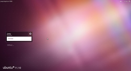
On the whole LightDM works as it should, although I did detect some noticeable lag when using it on my netbook. On my desktop the greeter worked well.
Applications
The default application set has been updated and upgraded. You’ll find the following sitting pretty in the beta: -- GNOME 3 and associated packages (nautilus, eog etc)
- Firefox 7 (beta)
- LibreOffice 3.4.2
- Shotwell photo manager (with hierarchal tags)
- Rewritten Gwibber
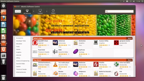
- Revamped Ubuntu Software Centre
The Dash
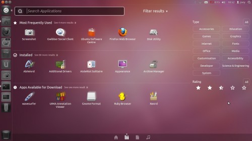
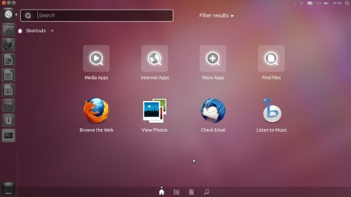
Ubuntu 11.10 builds upon the interface changes introduced in Ubuntu 11.04. Refinements to the Unity interface are apparent: a new look ‘Dash’ ‘triggered’ by a new look launcher-based button are the most visible.The Dash now has its own window controls, positioned at the top left-hand of the screen, which allow you to maximize the Dash, return it to “half screen” or close it. Fiddly on a touchscreen, but I’ve no need to continually resize the Dash anyway.
In this Beta I experienced a few performance issues with the Dash including lag and weird looking layered icons in search results. If you’re testing don’t expect a perfectly polished performance just yet.
Lenses
‘Lenses’ provide you with a quick way to search for specific files or information. For Ubuntu 11.10 they have been moved from individual items placed on the Unity Launcher and integrated into the Dash itself. From here Lenses can be selected using the “tabbed” strip of icons towards the bottom of the Dash.The File and Application Lenses have been brought over to the Dash, and a new Music lens added.

All three have various filtering options: -
- Filter Applications by category and Ubuntu Software Centre star rating
- Filter Files by Date created, size or type?
- Filter Music by date or genre
Star rating filters
Applications can be searched by star rankings. Am I really going to have a need to solely find 3 and a 1/2 star music? It seems like a neat solution to have, but it’s one seeking a problem to solve, too.
“OH NOES!! NO WINDOW CONTROLS!!″
The most controversial change present in the Beta is the hiding of window controls on maximized window by default.
When an application window is maximized the window controls, to much controversy, hide by default. Although you only need to mouse over top the panel to access them, many early adopters have reacted negatively to the change citing it as ‘unintuitive‘ and potentially confusing to newcomers.
“Oh, you have to move the arrow to the top of the screen [to see Window Controls]. Odd.”Whilst the “change” is odd, and a bit daft, I’m rather content with it. But to better help guage whether or not it on the fail side of, well, fail, I hijacked some of the family present at my mothers 70th birthday celebration in order to find out what “casual computer users” – 2 of whom use Windows XP, 1 uses Windows 7 and 1 uses OS X – make of the change…
The Task: Using Ubuntu 11.10, I asked them to close a maximised Firefox window.
After a few titters at comments such as “This version of Windows looks nice/I like the pretty thing on the side/Is this that new ‘My Windows 7?’” they got down to completing the task.
Result? All managed it – and all fairly quickly.
I was surprising that all managed to complete the simple task – including my 69 year old Auntie. Only one of my guinea pigs ‘went to the top’ of the screen instantly (the mac user). The rest spent a good few seconds sprinting around the screen with the mouse cursor until the buttons revealed themselves. As soon as they saw the buttons they knew what they did and, when asked to repeat the process 30 mins and 1 sherry later, they all remembered exactly where to find the buttons and how to “reveal” them.
Of course, this unscientific study doesn’t prove that this approach is the right one, and with enough time anyone would uncover the window control buttons eventually, ut it does go some way to show that if non-Ubuntu users can adapt fairly quickly to this change then long-term users of the OS can too. It’s a bit odd, but it’s really rather trivial in the end.
Little things that count
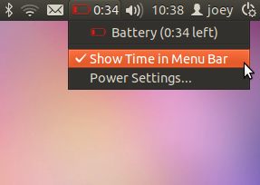
Aside from the big, bold and easily noticeable changes come a raft of smaller UI tweaks and fixes that are worth mentioning: -The Battery Indicator now works. An option to display battery time remaining/until charge on the panel can be toggled through the Battery menu.
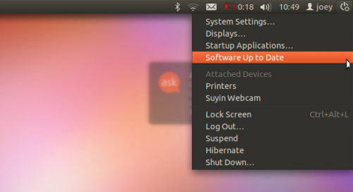
The “Device Menu is a new addition, housing a new icon and various new options, including attached devices and system update status
New User Menu with Avatars and Guest user switching: -
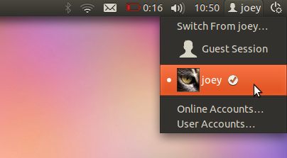
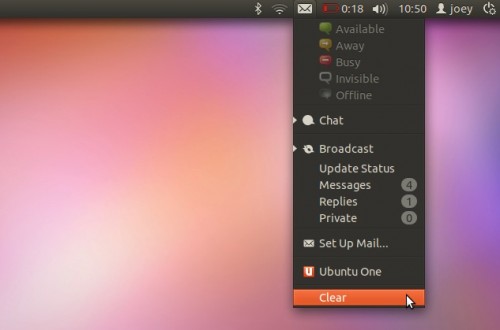
Messaging menu with “clear” option lets you acknowledge new tweets, e-mails or IM chats without having to actually open the corresponding app. So simple, yet so welcome.
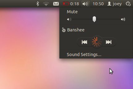
When launching Banshee through the Sound Menu the ‘Play’ button displays a new rounded loading animation. In Ubuntu 11.04 the Play button would simply ‘pulse’.
Tidak ada komentar:
Posting Komentar